

Writing a resume is one thing. How you present it is another.
The format of your resume has an impact on both your hiring manager and the applicant tracking system.
Sure, the default setting on the word document you’re using is one option…
But if you want to stand out within the first few seconds and show you’ve gone the extra mile, the right resume fonts will help you make that impression.
Some fonts could help you write more information without taking up too much space. In contrast, there are fonts that could help you fill the space on your resume.
Ultimately, the best font depends on your goals and your situation.
In this guide, we’ll go through everything you need to know. We’ll also go through the most common fonts professionals use as well as the font that helped more than 50% out of 245,000+ job seekers secure an interview.
Why Should You Bother About Your Resume Font?
You have a mere 6-7 seconds.
According to research, it was found that 24% of hiring managers spend less than 30 seconds reviewing a resume. Within those seconds, they’ll already form their own impressions about professional summary.
Besides the writing itself, the way your resume looks is a significant factor to consider. What they see first depends on what you’ve written and how it’s formatted. If this is done well, it could give your hiring manager confidence in your ability at first glance which could have an impact on how you’re perceived throughout the hiring process.
Here are a few elements candidates could use to make certain parts of their resumes stand out:
- Font choice
- Bold text
- All caps
2 Types of Fonts for a Resume
There are two different types of professional fonts to use on a resume:
- Serif
- Sans serif
Serif fonts hold a classic look with a small stroke in their letters. Whereas sans serif fonts don’t have the same small stroke but hold a more modern look.
Typefaces that fall into either of these categories are usually formal and suitable enough for your job application.
Serif Font
Here are some popular serif font choices. All of these are appropriate for overcoming the applicant tracking system.
Times New Roman
Old but gold. This is a timeless font to use for your resume and corporate work documents. While it’s not as modern as some of the other options, it’s easy to read for both a human reader and the ATS.
Cambria
Another great example of a simple yet visually pleasing typeface. With serif fonts in general, the added stroke in each letter improves the readability level.
Didot
Didot holds a clean and formal look. It’s elegant and a good choice to use especially if you’re applying for a job in the art and creative industries.
Garamond
This is an elegant resume font for professionals too. It’s also been used by many authors for their novels. J.K. Rowling’s Harry Potter is a good example.
Merriweather
Out of all the fonts mentioned in this blog post, this is the one we recommend the most.
Merriweather is perfect for online applications where your resume is read through a screen by both an ATS and human reader. On top of being highly readable and pleasing to the eye, it’s useful for maximum content density. In other words, you can write more words in your resume without having to increase the font size.
Sans-Serif Font
Compared to a serif typeface, sans-serif has a more modern aesthetic. Aside from these being minimal, it’s legible to use for writing your cover letter and resume.
Helvetica
This is a good alternative font to what most job seekers use (Arial). In the design industry, it’s widely popular for a reason. It’s a sleek and versatile typeface with a neutral feel, which is why it can be used for several different types of documents.
Georgia
Georgia makes a resume easy to read even if you have a smaller font size than the average. It’s used in many modern contexts and has been described as a friendly yet formal font choice.
Calibri
It’s one of the standard fonts used by professionals. It’s also the default font choice for a Microsoft Word document. This option holds a casual look with nice spacing and readability.
Arial
Arial is one of the most common fonts used. It’s a classic well-designed typeface that’s easy to read.
Verdana
One of the main advantages of the Verdana typeface is that each character is larger and wider. This makes it easier to read through despite having smaller font sizes. Since it’s made specifically for online documents like Georgia, it can be a good option to use if you’re submitting your resume over email resume file format.
Poppins
Poppins is a neat and simple font. The minimal design allows for high readability on both desktop and mobile devices.
Source Sans Pro
Source Sans Pro is a modern font that’s readable even if it’s in lower font size. It’s used in Rezi’s bold and alternative resume templates. Job seekers at all levels have used this typeface to create unique resumes with a modern design that has no issue in getting past a company’s ATS.
Trebuchet MS
Trebuchet MS offers a professional typeface that’s easy on the eyes. It could be a good font to use if you’re looking to fill the space on your resume.
Montserrat
Montserrat has a clean and modern aesthetic. It’s a simple design where each character is wider but with less weight. This makes it pleasing to the eye and easy to read through.
Lato
The Lato typeface has a friendly feel to the reader. However, it still maintains a formal and serious look so it’s appropriate for use in corporate environments.
What Font Should a Resume Be In?
It depends what you’re looking for. Are you:
- Trying to fit more words in using less space?
- Trying to fill the white space on your resume?
- Trying to make your resume the most visually pleasing?
We’ll go through a list of the most common resume fonts including our recommendations for some of the points above. Use your best judgment to decide which is most suitable for your needs.
The only rule to follow is to ensure it looks professional. It should also be readable by both a human and the resume scanners.
The Most Common Font Professionals Use
The most common fonts used for resumes include the following:
- Arial
- Times new roman
- Calibri
Some of these are the default font options in documents such as Google docs and Microsoft Word.
Resume Fonts to Fit More Words In
Reducing your font size isn’t the only way to fit more words into your application. Another way to do it is by choosing the right typeface optimized for space.
Here are a few examples:
- Garamond
- Cambria
- Merriweather
Resume Fonts to Fill the White Space
This time, increasing your font size isn’t the only option. Even if you have a no work experience, there are things you can do to make yourself look just as competent as the other experienced candidates.
Here are a few examples of resume fonts that take up more space:
- Poppins
- Verdana
- Source Sans Pro
- Trebuchet MS
Professional Fonts Most Pleasing to the Eye
Here are some professional fonts that are most readable and pleasing to the eye:
- Helvetica
- Montserrat
- Lato
- Merriweather
- Poppins
Look for fonts that are minimal. It should have enough spacing between characters as well as neat strokes and a professional aesthetic.
However, it’s difficult to categorize the answer into a one size fits all because it’s subjective.
Are There Any Outdated Fonts for a Resume?
Arial and Times new roman is one of the most common fonts used for a resume. Followed along by a standard font size of 11 or 12 pt. Both of these fonts work for getting past the ATS and ensuring you have a readable application.
While these are the most popular choices by job seekers, it’s the same reason why we’re against using them.
2 of the Worst Types of Fonts to Use on a Resume
Avoid using any of the typefaces that fall into one of these categories.
You’ll lead yourself into a dead end from the initial screening process since they’re unreadable by the ATS. If they do somehow get past the resume scanners, the style may appear inferior and unprofessional to your hiring manager.
Script Fonts
Script fonts are derived from calligraphy and handwriting.
It’s similar to cursive fonts because letters are usually joined up. They’re good for informal writing such as birthday cards or letters. They can also be good for marketing purposes depending on a company’s brand and the industry they’re in.
But for writing a resume, it’s a no go.
Here are some examples of script and cursive fonts:
- Comic sans
- Monarda
- Pacifico
Display Fonts
Display fonts are typically used for headings and titles since the typeface is large.
They’re also known as decorative fonts. By the name itself, it’s clear why it’s not a good choice for your resume. On top of looking unprofessional in most cases, it’s distracting to the eye because of how big the typeface is. This makes it difficult for both employers and the ATS to skim through your application.
Here are some examples of display fonts:
- Adevale
- Bourton
- Sugar boats
The Best Resume Font Size
The highest font size for a resume should be no more than 12 pt. On the other hand, the lowest font size should be 10 pt. If you need to push it down to 9 pt to make everything fit into a single page, so be it.
And if you still want to make more room for space, try adjusting the margins. Generally, it’s one inch all around but -0.5 inches is the lowest you could go.
However, don’t make the common mistakes on resumes of adding fluff.
4 Quick Resume Formatting Tips
Here are some resume formatting tips to make a strong first impression:
- Use bullet points to keep your resume concise and straight to the point
- Don’t overcomplicate the layout of your resume
- Send your resume as a PDF
- Make your career timeline transparent
Want to know how to correctly format your resume? Learn more in our guide here about ats resume format.
5 Factors to Consider for Your Resume Font
Your resume reaches the hiring systems first before the hands of your employers.
Besides having an ats optimized resume, there are ways to use your font to make certain points in your resume stand out. There are things you should avoid too, which we’ll go through below.
Bold Text
Bold text is especially great for your resume section headers. It’s effective for highlighting parts of your resume clearly for the reader. One example is making your previous job positions from your work experience and the dates of employment clear.
Underlined Text
Double columns on resumes are quite common. It’s also common to use lines in your resume to make it more readable.
Underlined text is only acceptable if it’s used for your section headers. But you should never underline text within the main body of your resume. Plus, it most likely won’t get picked up by the applicant tracking system.
Italics
Italics are sometimes acceptable and can be used for certain parts of your resume. For example, the dates of employment in your work experience section. However, we don’t recommend it since it might not always be picked up on by an ATS.
ALL CAPS
Using capitalized text can add structure to your application.
If all the font settings were the same throughout your resume, it makes it less likely to leave an impression on your hiring manager at first glance. In the resume examples later on, you’ll notice how each resume section header uses all caps and bold text to draw the reader’s attention.
Consistency
Don’t use bold text with all caps for writing one job position and date of employment then use normal text for another. Or don’t use one font for your summary section and then a different font for your other resume sections.
Be consistent with your formatting strategy. Otherwise, it won’t flow as smoothly as it should.
The same rule applies to the format of your cover letter.
Resume Examples With a Format Optimized for the ATS
Taking into account the format settings of your font, here are some ATS-friendly resume examples designed to get your employer’s attention.
Data Engineer Resume (Interviewed at Facebook)

Embedded Software Developer Resume (Interviewed at AMD)

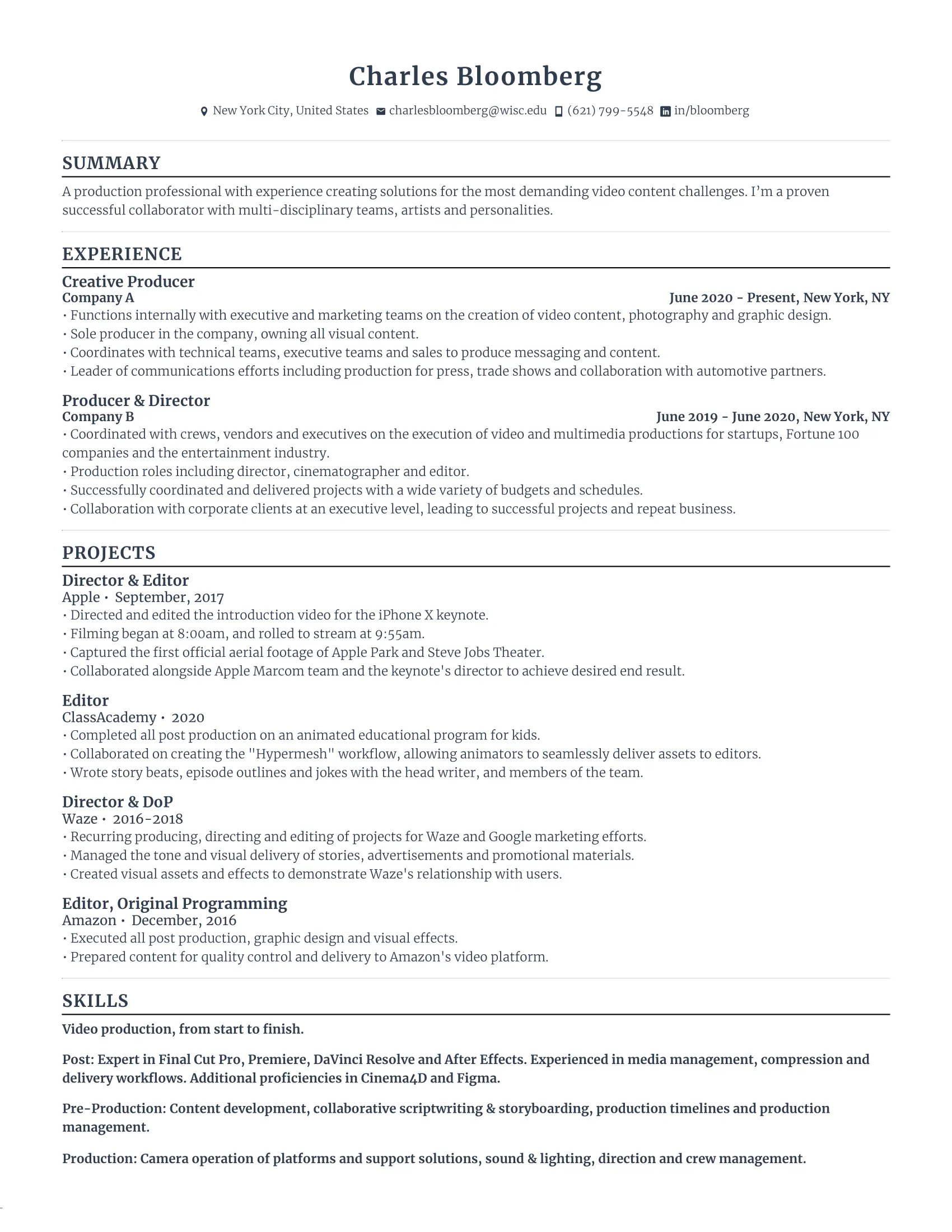
Creative Producer Resume (Interviewed at Tesla)
Associate Consultant Resume

Technical Project Manager Resume

The Resume Font That Helped More Than 50% Out of 245,000+ Job Seekers Secure an Interview
The font used at Rezi is a serif typeface known as Merriweather.
More than 245,000 job seekers have used this font for their resumes and out of all those applicants, over 50% landed an interview.
It’s readable, sleek, and suitable for professionals at all levels.
As hiring managers flick through the list of applications, yours is more likely going to be the one they stop an extra second for.
Why? Because it’s different from everyone else.
It catches the hiring manager off guard which means they could spend more time reading through your resume. Assuming it’s well written and you retain their interest, it makes you more memorable and someone worth looking into.
Never Agonize Over Your Resume Format Again
Never worry about your resume format or font ever again.
Only focus on the writing part. Rezi will make everything else easy so that you can complete your resume in less time and effort.
In fact, you could complete your resume in less than 5 minutes using an AI writer.
All you need to do is enter your job title. The description will be written by itself based on its duties and responsibilities.
Watch the clip below to see how it works.
Sounds good? Then, let’s not waste anymore time pondering over what to put on your resume and how to format it by getting started using the link below!
Explore Rezi 🔥 Comes with 5,000 AI Credits, and is free forever, no credit card required.
Final Thoughts
Resume fonts are one aspect of many that influence your recruiter’s first impression.
Although it should be readable for the ATS, it should also be easy on the eye. The best resume fonts are the ones that are simple.
Even after you’ve edited your resume format, see how it looks in person by printing it. Is it still readable? Or is it actually harder to read through the content compared to when you read it on your laptop?
It’s worth asking someone else for their opinion too. If you find it’s not as perfect as you thought, reconsider the typeface alongside the font size.

